Input Controls
Input controls are interactive UI elements (such as text fields, file pickers, and dropdowns) that allow users to provide data to scrapers. With minimal JavaScript, you can create complex forms, making your desktop extractors more user-friendly.
Key Concepts
- Scraper-Input Binding: Each scraper's controls are defined in a matching
.jsfile within theinputs/folder. For example,stockPriceScraper.jsfor a scraper namedstockPriceScraper. - Dynamic UI: Change controls dynamically using
isShownorisDisabledto hide or disable fields based on user input. - Validation: Enforce mandatory fields with
isRequiredor implement custom validation logic (e.g., regex checks) usingvalidate.
Types of Controls
text
A single-line text field.
Example
.text("stock_symbol", {
  placeholder: "Enter a stock symbol (e.g., AAPL)",
  defaultValue: "AAPL",
  isRequired: true,
})
listOfTexts
Multiple single-line text fields. Use the optional limit parameter to cap the maximum number of items that can be entered.
Example
.listOfTexts("search_queries", {
  placeholder: "python",
  defaultValue: ["python", "javascript"],
  limit: 5,         // maximum 5 queries
  isRequired: true, // at least 1 query must be provided
})
link
A single-line URL field.
Example
.link("website", {
  placeholder: "https://example.com",
})
listOfLinks
Multiple single-line URL fields. Use the optional limit parameter to cap the maximum number of links that can be entered.
Example
.listOfLinks("product_urls", {
  placeholder: "https://example.com/product/item",
  limit: 5,          // maximum 5 links
  isRequired: true,  // at least 1 link must be provided
})
number
A numeric input (integer or float). The placeholder, min, max, and defaultValue parameters are optional.
Example
.number("max_results", {
  placeholder: 100,
  min: 1,
  max: 1000,
  defaultValue: 50,
})
numberGreaterThanOrEqualToZero
A number field that enforces a minimum value of 0.
Example
.numberGreaterThanOrEqualToZero("retry_delay_in_seconds", {
  placeholder: 5,
})
numberGreaterThanOrEqualToOne
A number field that enforces a minimum value of 1.
Example
.numberGreaterThanOrEqualToOne("retries", {
  placeholder: 3,
})
select
A single-select dropdown menu. It requires either an options array or a searchMethod for dynamic option fetching.
Example - Static Options
.select("category", {
  options: [
    { value: "tech",     label: "Technology" },
    { value: "robotics", label: "Robotics"   },
    { value: "ai",       label: "AI"         },
  ],
  defaultValue: "tech",
})
Example - Dynamic Options
.select("city", {
  searchMethod: "searchCityOptions",  // Backend method that fetches options
  canCreateOptions: true,          // Allow users to create custom options
  defaultValue: {value: 'US__CA__SF', label: "San Francisco"},
})
Default Value Format:
- For static
options: Use a string value (e.g.,"tech") - For
searchMethod: Use an object withvalueandlabelproperties:defaultValue: {value: 'US__CA__SF', label: "San Francisco"}
Additional Parameters:
canCreateOptions(optional, default:false) - Allows users to type and create custom valuessearchMethod(optional) - Name of the backend handler function for dynamic option fetching
How to Dynamically fetch Options with searchMethod
To use searchMethod, you need to define async handler functions and add them using Server.addSearchOptionsEndpoints().
Input JS Implementation:
.select("city", {
  searchMethod: "searchCityOptions",  // Backend method that fetches options
  canCreateOptions: true,          // Allow users to create custom options
  defaultValue: {value: 'US__CA__SF', label: "San Francisco"},
})
server.ts Implementation:
import { Server } from 'botasaurus-server/server';
import axios from 'axios';
import { config } from '../../main/config';

const baseUrl = config.isDev ? "http://0.0.0.0:3000" : "https://api.my-app.com";

async function searchCityOptions(query: string, data: any) {
  const params = {
    query,
  };

  try {
    const response = await axios.get(`${baseUrl}/search/cities`, { params });
    return response.data; // Must return array of { value, label }
  } catch (error) {
    throw error; // Propagate errors for proper handling
  }
}

// Register the search endpoint
Server.addSearchOptionsEndpoints({
  searchCityOptions,
});
Handler Requirements:
- Receives two parameters:
query(string) anddata(object with all form field values) - Must return an array of objects with
valueandlabelproperties - Errors (including Axios errors) are automatically caught and displayed to users
multiSelect
A multi-select dropdown menu. It requires either an options array or a searchMethod for dynamic option fetching. The optional limit parameter sets the maximum number of selections.
Example - Static Options
.multiSelect("tags", {
  options: [
    { value: "tech",     label: "Technology" },
    { value: "robotics", label: "Robotics"   },
    { value: "ai",       label: "AI"         },
  ],
  defaultValue: ["tech", "ai"],
})
Example - Dynamic Search with Bulk Add
.multiSelect("cities", {
  searchMethod: "searchCityOptions",   // Backend method that fetches options
  canCreateOptions: true,           // Allow users to create custom options
  canBulkAdd: true,                 // Enable bulk add/edit functionality
  defaultValue: [{value: 'US__CA__SF', label: "San Francisco"}],
})
Default Value Format:
- For static
options: Use an array of strings (e.g.,["tech", "ai"]) - For
searchMethod: Use an array of objects withvalueandlabelproperties:defaultValue: [
{value: 'US__CA__SF', label: "San Francisco"},
{value: 'US__NY__NYC', label: "New York"}
]
Additional Parameters:
limit(optional) - Maximum number of items that can be selectedcanCreateOptions(optional, default:false) - Allows users to type and create custom valuescanBulkAdd(optional, default:false) - Enables bulk add/edit functionality with a "Bulk Add" or "Bulk Edit" button below the controlsearchMethod(optional) - Name of the backend handler function for dynamic option fetching
Bulk Add Functionality:
When canBulkAdd is enabled, a button appears below the multi-select control allowing users to paste multiple values at once. Bulk add supports multiple input formats:
- JSON array:
["New York", "San Francisco", "Chicago"] - Comma separated:
New York, San Francisco, Chicago - Newline separated:
New York
San Francisco
Chicago
checkbox
A Boolean checkbox. Defaults to false if no defaultValue is provided.
Example
.checkbox("include_reviews", {
  defaultValue: true,
})
textarea
A multi-line text field.
Example
.textarea("description", {
  placeholder: "Enter a detailed description",
})
switch
A Boolean toggle switch (an alternative to checkbox). Defaults to false if no defaultValue is provided.
Use switch instead of checkbox when the toggle is meant to reveal hidden controls via isShown. For example, showing Advanced Settings. Using checkbox for this purpose is an anti-pattern.
Example
.switch("show_browser")
search
A text input with search-specific styling.
Example
.search("search_query", {
  isRequired: true,
})
choose
Displays options as clickable buttons (an alternative to select). It requires an options array.
Use choose instead of select when you have fewer than 3 options for better user experience.
Example
.choose("theme", {
  options: [
    { value: "light", label: "Light" },
    { value: "dark",  label: "Dark"  },
  ],
  defaultValue: "light",
})
filePicker
Allows users to upload one or more files. Supports the accept, multiple, and limit parameters.
Example
/**
 * @typedef {import('botasaurus-controls').Controls} Controls
 * @typedef {import('botasaurus-controls').FileTypes} FileTypes
 */

const { FileTypes } = require('botasaurus-controls');

/**
 * @param {Controls} controls
 */
function getInput(controls) {
  controls.filePicker("product_images", {
    accept: FileTypes.IMAGE, // restrict to image files ('jpeg','jpg','png','gif','bmp','svg','webp')
    limit: 20,               // maximum 20 files
    isRequired: true,        // at least 1 file is required
  })
}
To allow only one file to be selected, set multiple to false:
/**
 * @typedef {import('botasaurus-controls').Controls} Controls
 * @typedef {import('botasaurus-controls').FileTypes} FileTypes
 */

const { FileTypes } = require('botasaurus-controls');

/**
 * @param {Controls} controls
 */
function getInput(controls) {
  controls.filePicker("product_image", {
    accept: FileTypes.IMAGE,
    multiple: false,
    isRequired: true, // a file is required
  })
}
section
Groups related controls into a collapsible section. Keep in mind that sections cannot be nested inside other sections.
Example
.section("User Details", (section) => {
  section
    .text("first_name", {
      placeholder: "John",
      isRequired: true,
    })
    .text("last_name", {
      placeholder: "Doe",
      isRequired: true,
    })
    .number("age", {
      min: 18,
      isRequired: true,
    })
})
addLangSelect
A prebuilt language dropdown with 187 languages.
Example
.addLangSelect({
  label: "Preferred Language",
  defaultValue: "en",
})
The selected language is accessible via data["lang"] in the scraping function.
addCountrySelect
A prebuilt country dropdown with 252 countries.
Example
.addCountrySelect({
  label: "Target Country",
  defaultValue: "US",
})
The selected country is accessible via data["country"] in the scraping function.
addProxySection
Adds a section with proxy controls.
Example (single proxy)
.addProxySection()
Set isList to true to allow users to enter multiple proxies.
Example (proxy list)
.addProxySection({
  isList: true,
})
Also, you can get the proxy (or proxy list) from the proxy field in the metadata:
const taskScraper = task({
  name: "taskScraper",
  run: ({ data, metadata }) => {
    const proxy = metadata["proxy"]
    return data
  },
})
Control Options
All controls support a common set of options that allow you to customize their label, default value, validation logic, visibility, and more.
label
The label is displayed above the control. If omitted, the control ID (e.g., stock_symbol) is shown in Title Case.
Example
.text("stock_symbol", {
  label: "Ticker Symbol",
})

defaultValue
Sets the initial value for the control when the form loads.
Example
.select("category", {
  options: [
    { value: "tech",     label: "Technology" },
    { value: "robotics", label: "Robotics"   },
    { value: "ai",       label: "AI"         },
  ],
  defaultValue: "tech",
})

isRequired
Enforces mandatory field validation. This can be a boolean value or a function that decides based on other inputs.
Example - Boolean isRequired
.link("website", {
   isRequired: true,
 })

Example - Dynamic Requirement
.text("phone_number", {
  isRequired: (data) => data["contact_method"] === "phone", // Required only if contact_method is phone
})

validate
A custom validation function that returns an error message if validation fails. It can return a string or an array of strings for multiple errors.
Note:
- A control value can be
null, but is neverundefined, so you never need to check forundefined. - If a control is hidden or disabled, validation is skipped.
- If a control fails the
isRequiredcheck, validation is skipped. This is why we don't need to check fornullin the second multiple errors example.
Example - Validate an Email Address
.text("email", {
  validate: (value) => {

    const emailRegex =  /^(([^<>()[\]\\.,;:\s@\"]+(\.[^<>()[\]\\.,;:\s@\"]+)*)|(\".+\"))@((\[[0-9]{1,3}\.[0-9]{1,3}\.[0-9]{1,3}\.[0-9]{1,3}\])|(([a-zA-Z\-0-9]+\.)+[a-zA-Z]{2,}))$/
    if (!emailRegex.test(value)) {
      return "Please enter a valid email address"
    }
  },
})

Example - Multiple Errors
.number("age", {
  isRequired: true,
  validate: (value) => {
    const errors = []
    if (value < 18) {
      errors.push("Must be 18 or older")
    }
   if (!Number.isInteger(value)) {
      errors.push("Age must be a number")
   }
    return errors
  },
})

helpText
Shows a question mark icon that displays help text when hovered over.
Example
.text("api_key", {
   label: "API Key",
   helpText: "Find API key in Dashboard → Settings → API"
})

isDisabled
Dynamically disables the control based on other inputs.
Example
.checkbox("use_custom_settings", {
  label: "Use Custom Settings"
})
.number("timeout", {
  label: "Timeout (seconds)",
  isDisabled: (data) => !data["use_custom_settings"],
})

disabledMessage
Tooltip explaining why a control is disabled. It's recommended to use this option when using isDisabled.
Example
.checkbox("use_custom_settings", {
  label: "Use Custom Settings"
})
.number("timeout", {
  label: "Timeout (seconds)",
  isDisabled: (data) => !data["use_custom_settings"],
  disabledMessage: "Enable custom settings to set this value"
})
isShown
Conditionally shows or hides a control based on other inputs. This is often better than isDisabled for optional sections like "Advanced settings" because it creates a cleaner UI by hiding complexity until needed.
A switch or choose control is recommended to toggle visibility.
Example
.switch('enable_reviews_extraction')
.numberGreaterThanOrEqualToZero('max_reviews', {
  label: 'Max Reviews per Place (Leave empty to extract all reviews)',
  placeholder: 20,
  isShown: (data) => data['enable_reviews_extraction'],
  defaultValue: 20,
})
.choose('reviews_sort', {
  label: "Sort Reviews By",
  isRequired: true,
  isShown: (data) => data['enable_reviews_extraction'],
  defaultValue: 'newest',
  options: [
    { value: 'newest', label: 'Newest' },
    { value: 'most_relevant', label: 'Most Relevant' },
    { value: 'highest_rating', label: 'Highest Rating' },
    { value: 'lowest_rating', label: 'Lowest Rating' },
  ],
})

isMetadata
When set to true, the control's value is passed in the metadata instead of the data parameter in the scraping function.
Example
.text("api_key", {
   label: "API Key",
   isMetadata: true,
})
In the scraper function, use it as follows:
const task = task({
  name: "taskScraper",
  run: ({ data, metadata }) => {
    const scraperId = metadata["api_key"]
  }
})
The metadata parameter is useful when you have enabled caching and want to exclude a field from being included in the cache key, such as api_key, cookies, proxy, etc.
Keep this in mind, as you will learn about caching in a later section.
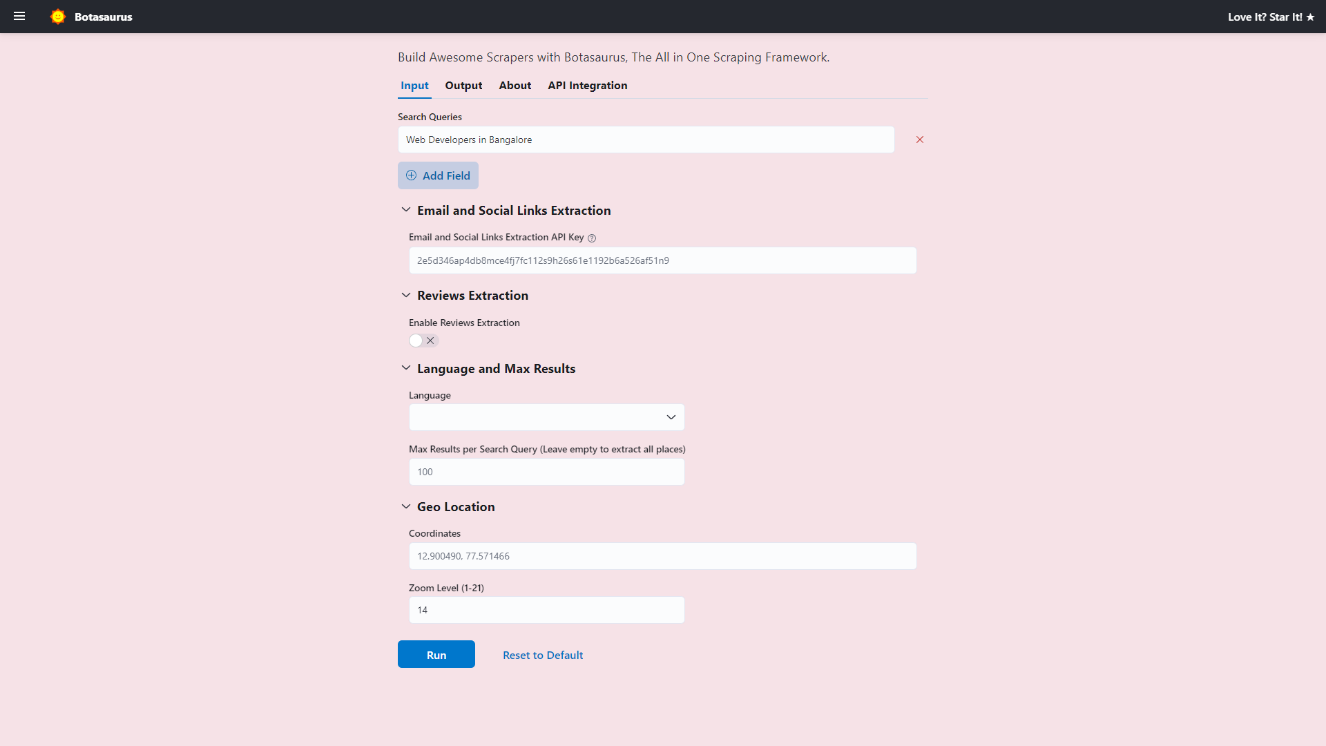
Real World Example
The following example demonstrates how to use listOfTexts, number, switch, choose, section, and other controls to build an advanced form:
/**
 * @typedef {import('botasaurus-controls').Controls} Controls
 */

/**
 * @param {Controls} controls
 */
function getInput(controls) {
  controls
    .listOfTexts('queries', {
      defaultValue: ["Web Developers in Bangalore"],
      placeholder: "Web Developers in Bangalore",
      label: 'Search Queries',
      isRequired: true,
    })
    .section("Email and Social Links Extraction", (section) => {
      section.text('api_key', {
        placeholder: "2e5d346ap4db8mce4fj7fc112s9h26s61e1192b6a526af51n9",
        label: 'Email and Social Links Extraction API Key',
        helpText: 'Enter your API key to extract email addresses and social media links.',
        isMetadata: true,
      })
    })
    .section("Reviews Extraction", (section) => {
      section
       .switch('enable_reviews_extraction', {
          label: "Enable Reviews Extraction",
        })
        .numberGreaterThanOrEqualToZero('max_reviews', {
          label: 'Max Reviews per Place (Leave empty to extract all reviews)',
          placeholder: 20,
          isShown: (data) => data['enable_reviews_extraction'],
          defaultValue: 20,
        })
        .choose('reviews_sort', {
          label: "Sort Reviews By",
          isRequired: true,
          isShown: (data) => data['enable_reviews_extraction'],
          defaultValue: 'newest',
          options: [
            { value: 'newest', label: 'Newest' },
            { value: 'most_relevant', label: 'Most Relevant' },
            { value: 'highest_rating', label: 'Highest Rating' },
            { value: 'lowest_rating', label: 'Lowest Rating' },
          ],
        })
    })
    .section("Language and Max Results", (section) => {
      section
        .addLangSelect()
        .numberGreaterThanOrEqualToOne('max_results', {
          placeholder: 100,
          label: 'Max Results per Search Query (Leave empty to extract all places)',
        })
    })
    .section("Geo Location", (section) => {
      section
        .text('coordinates', {
          placeholder: '12.900490, 77.571466',
        })
        .numberGreaterThanOrEqualToOne('zoom_level', {
          label: 'Zoom Level (1-21)',
          defaultValue: 14,
          placeholder: 14,
        })
    })
}